
The Royal Ontario Museum underwent a major renovation in 2007 connecting its historic building with the Daniel Libeskind Crystal. The new layout made it difficult for visitors to find their way around the museum as the floors did not connect seamlessly and the spaces were defined by vastly different architectural styles. I worked with the wayfinding lead to develop a plan to make navigating the buildings easier. I led the user testing, gathered directional information and helped design the wayfinding system.
We spoke with visitor services and staff in the museum to see where they thought major pain points were. We also spoke to the security guards who fielded directional questions daily. Key issues arouse quickly:
After hearing from the museum staff we spent days in the museum observing visitors. We immediately could see how confusing and disorienting the space was, especially for first time visitors.
An example of a typical journey would be: A visitor is searching for a gallery. They know what floor it’s on. They get directions from staff to an elevator. They get off the elevator in a cavernous white space and have little idea of which way to go next. They make it out of the elevator hall and look around confused. They pull out their map and consult with their friend. They can’t find where they are and then seek out another staff member for further directions. While the gallery they are looking for is around the corner, and it is incredible, their first feeling is frustration or annoyance.
Synthesizing this initial research we developed plans for temporary signage to quickly test potential improvements. When creating the signs we had to consider visitor pain points, areas where people were most disoriented or lost, major destinations, the multiple ways in which visitors could reach a destination and all the visual distractions they may encounter. We designed and installed 45 temporary signs on two levels of the museum.
Once this signage was in place we created an online survey to find candidates to do in person observations. We created a visitor journey and asked participants to find galleries and places in the museum. We followed participants around and tracked their success. It was easy to identify when signage failed or worked by how quickly and easily they arrived at their destination. We rated the success of each sign and identified areas for improvement. See the full user tracking evaluation here. We then went back to designing solutions based on the unique characteristics of each location in the museum. We knew we were on the right track when staff noted that the number of questions they fielded in our test locations was down. Visitors were finding their destinations.


The final proposal improved the visitor experience and addressed the key pain points:
Our final proposal included six categories of signs: directories, identification, directional, safety, advisory and gallery signs. The signs were in both French and English and Braille when needed and included a new series of pictograms. Each sign had to be measured and placed in the space available. We created 405 signs in 15 standard sizes. We mapped these out for installation. The material for each signed varied according to type and installation location. Boards, vinyls, and pin letters were used. Sections of walls were painted to work with the scheme. This is a selection of signs from the final proposal.

The sign placement for each level was mapped for easy review and installation. Each sign was assigned a color-coded label and identification number.

Signs in major pain point areas were installed making it easier for visitors to navigate the museum and reducing the number of directional inquiries and lost visitors. The full project was put on hold due to funding being redirected.
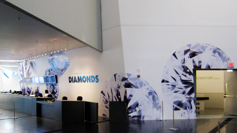
I worked on smaller wayfinding projects under the supervision of the head of design that were fully implemented. These included wayfinding signage within the restaurant, signage for encouraging recycling and composting in the restaurant and large wayfinding graphics for the Diamonds exhibition.
You might be wondering how the wayfinding process connects to the UX process. Matt Cooper-Wright of IDEO does a fantastic job of highlighting the connections in his article From Wayfinding to Interaction Design.
Good UX and good wayfinding are the same in that when it works it fades into the background.